How to Get the Most Out of RightCapital’s Snapshot Feature
February 10, 2023

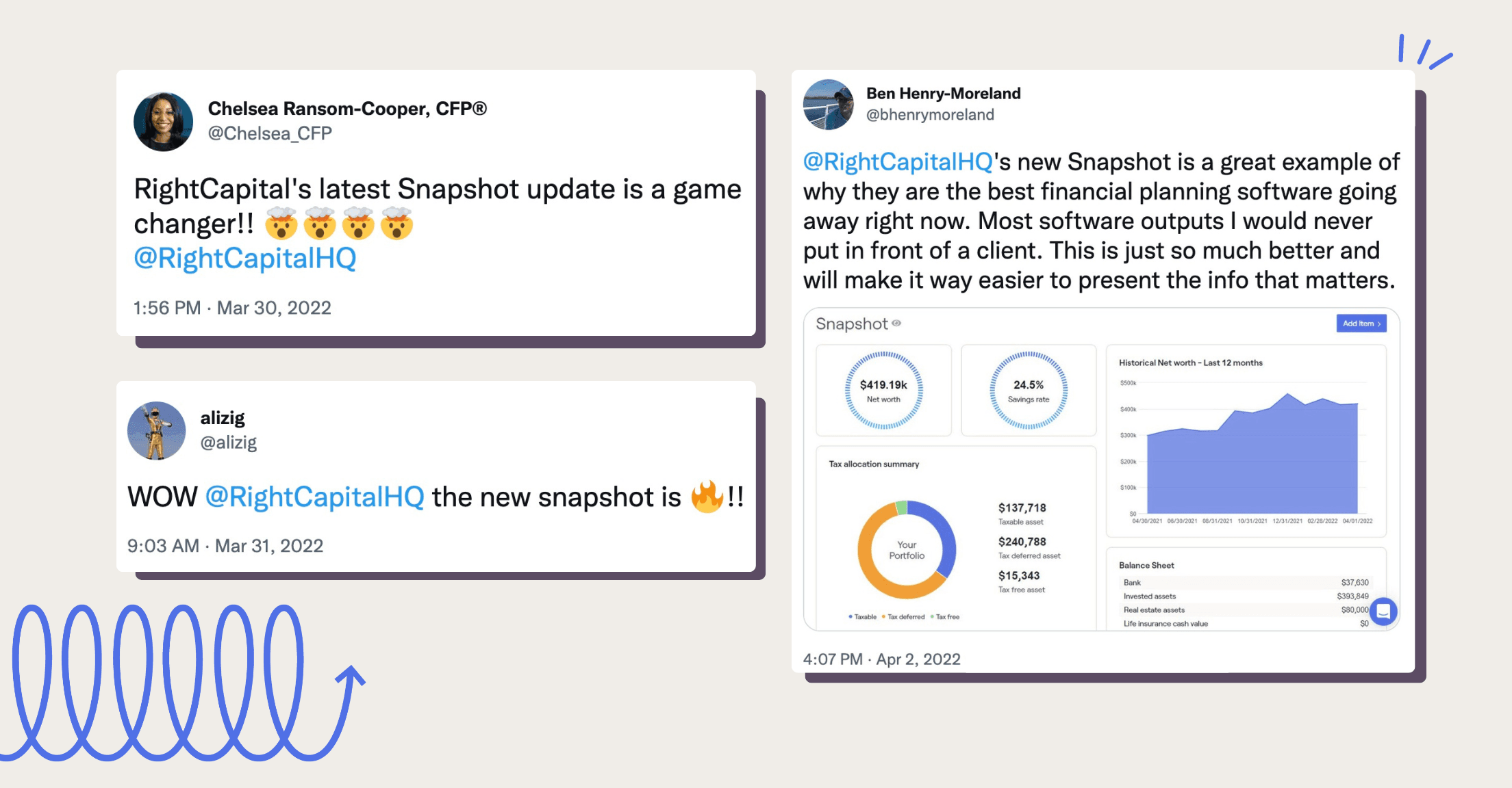
There has been a lot of chatter about the RightCapital Snapshot personalized plan summaries since the feature debuted in the spring of 2022. You may have heard the buzz about our “one-page plan”—customizable with whatever widgets you please, from key metrics such as probability of success and tax rates to investment, insurance, and retirement information—but we’d like to share what else you can do with Snapshot, to make it work best for you and your practice.
Tell the story of your clients’ financial lives
Become a storyteller, weaving together the journey of your client’s financial lives with charts, graphs, and explanations. Demonstrate where they’ve been and where they may be in the future as well as illustrate what-if scenarios.
Create efficiency and save time by using templates
If you’ve made the Snapshot of your dreams, feel free to copy it for other clients in your practice, whether for all of them or for specific client groups. For example, you might provide widgets related to budgeting and education planning for pre-retirees while providing life insurance analysis and tax-preferred distributions for clients who are already retired. Similarly, you may display different widgets for a prospect than you would for someone working with you for years.
Make adjustments in real-time
If something looks off or needs to be updated, making the edits within an individual module (for example, choosing stress test variables within the retirement tab) will then automatically update associated graphics you’ve chosen for the Snapshot without you having to add or remove them.
Communicate more than numbers and charts
Advisors have the option to add text blocks for notes into their visual Snapshot layouts. Format the text within the notes block to bold and italic, add a bulleted or numbered list, and include links. There are multiple size options for the text block and you can add as many as you’d like to communicate whatever messages you need to.
Stay organized with tasks
Streamline client communication by keeping their and your to-do lists top of mind within the Snapshot itself. The task box includes due dates and to whom each item is assigned.
Prioritize or deprioritize depending on needs
If you’d prefer clients see a different screen from Snapshot when logging into the client portal, you can change the position of that feature (and all others) by dragging and dropping items within the planning access tab. Choose to have it front and center during reviews when Snapshot offers an efficient overview of the financial plan, or move it to the end of the presentation to wrap things up when specific planning topics are more relevant.
Enhance your own visual creations
Snapshot can absolutely be used as your full visual output to a client but advisors may prefer to bring pieces of it into visuals that they have created themselves. We recently spoke with two advisors (Mike Zung of Java Wealth and Travis Gatzemeier of Kinetix Financial Planning) who are popular in the industry for making visually pleasing, comprehensive-but-concise plans for their clients and prospects.
Preview for page breaks
Snapshot has been called a “one-page plan” by members of the financial planning industry, but with the number of options, it can quickly become more than one page if that is your preference. Make sure the report will format to your liking by clicking the eye icon next to the Snapshot heading to preview the PDF report and see where the pages would break.
Share with your client easily
After perfecting your client’s Snapshot, you can share with them in a variety of ways. Download the report to print, email, or store in the secure document vault right within RightCapital.
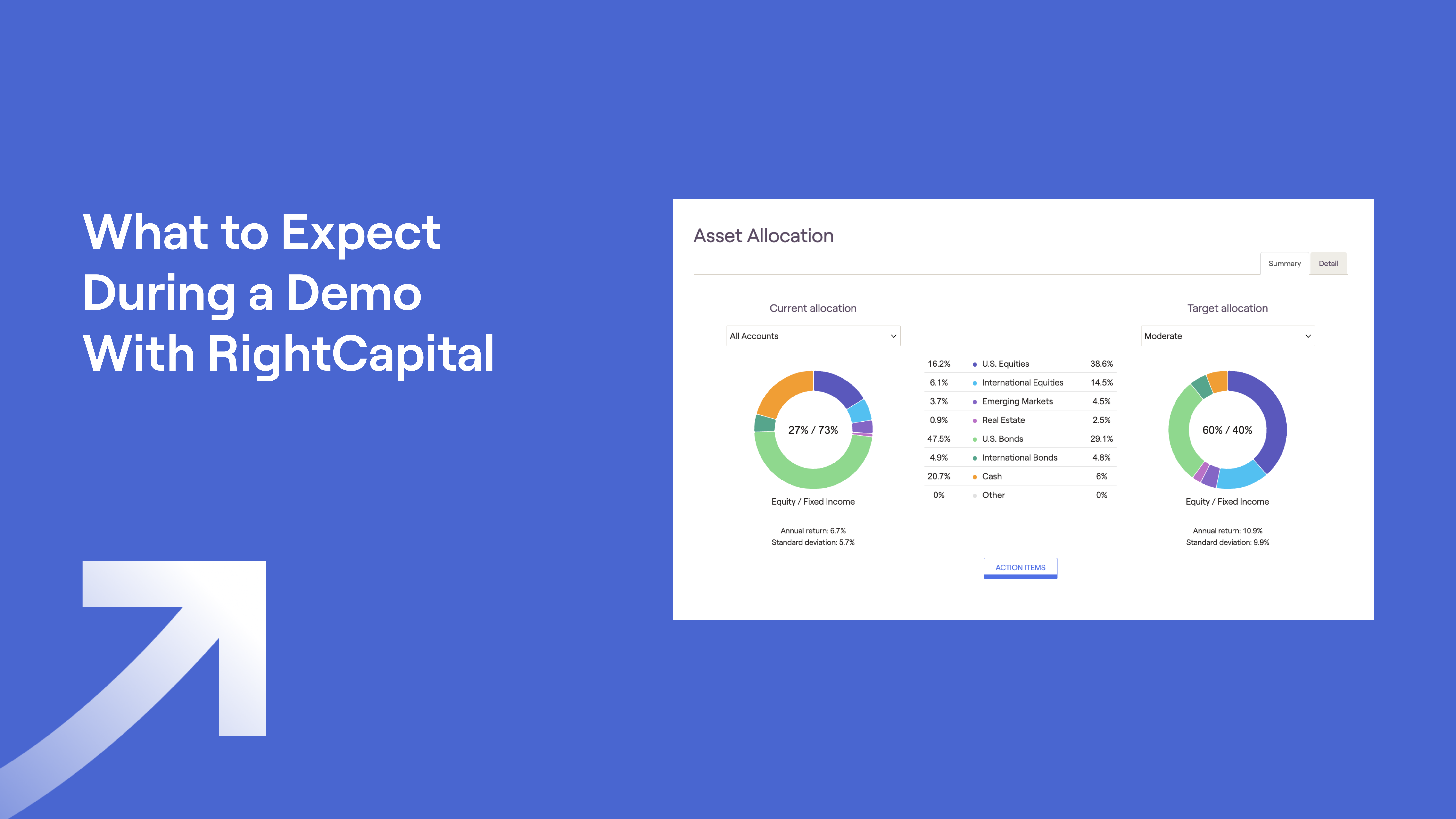
Learn more about Snapshot, RightCapital, and how we can help make financial planning a breeze by scheduling a 1:1 demo with one of our specialists.


