This article was originally written in February 2023. Since then, RightCapital has introduced another data visualization tool called Cash Flow Maps, which illustrates cash inflows and outflows in a horizontal Sankey "Waterfall" diagram and in “Breakdown,” a vertical flow chart where each item can be clicked into for more detail. Find out more.
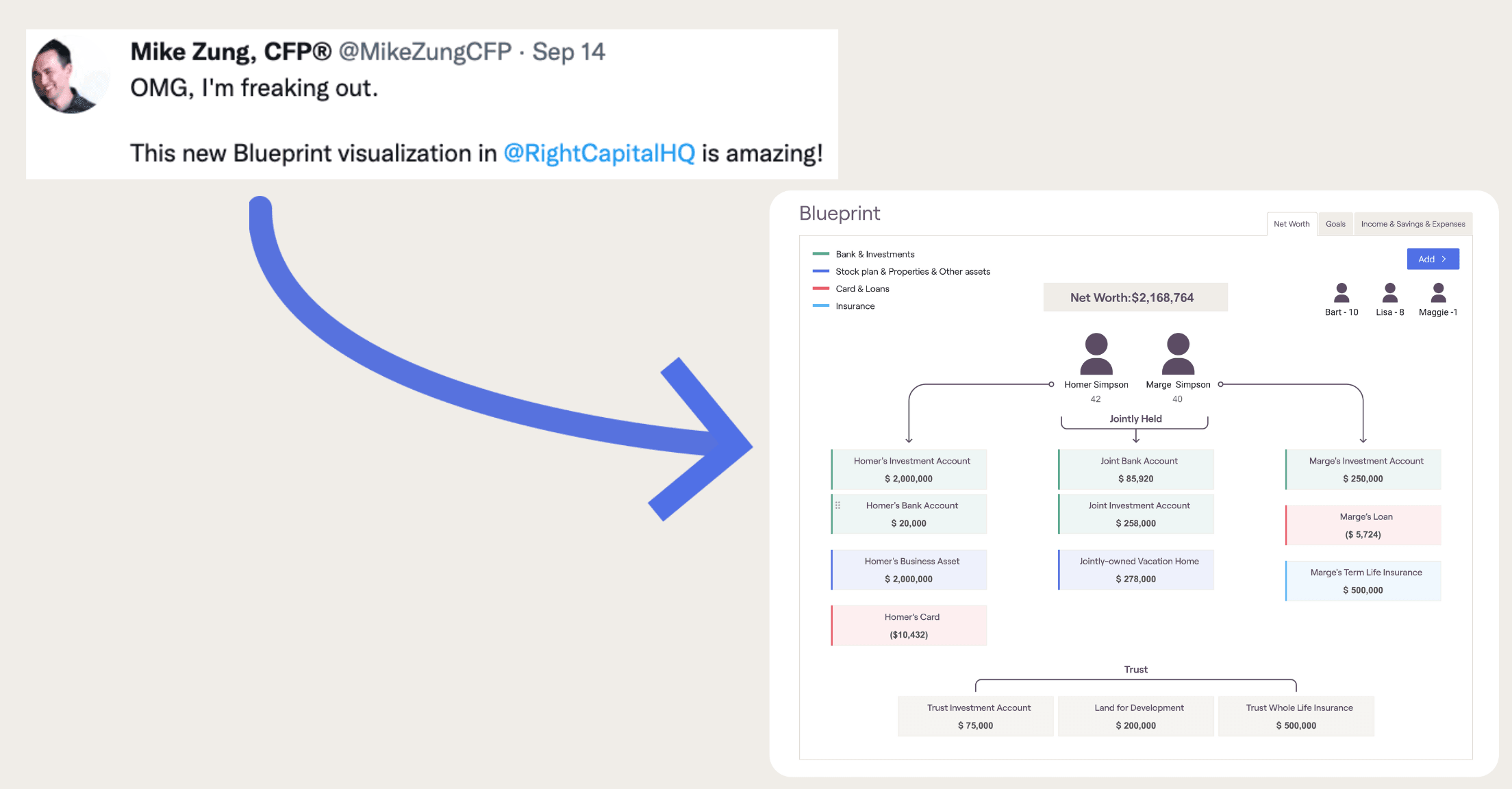
Data visualization is all the rage and we never want to be behind the curve. Reviewers of RightCapital have called our six-step data entry process “intuitive”, but in 2022, it grew even stronger with a feature called Blueprint™—called “a holistic mind-map of the client’s household finances” by Kitces. Just as a blueprint of a home might chart out the dimensions, materials, and wiring, RightCapital’s Blueprint feature provides clients and advisors with client-friendly, interactive, and sharable pictures of their financial lives. See where clients stand and where they want to go, while being able to edit everything within the module itself. Blueprint has been called a follow-up to our popular Snapshot feature, another customizable visual, often called “the one-page plan”.

In November 2022, fpPathfinder and RightCapital held a panel with two advisors who explained how they used visuals within their financial planning practices. Mike Zung of Java Wealth and Travis Gatzemeier of Kinetix Financial Planning both highlighted Blueprint and Snapshot as helpful add-ons to their previously existing visual outputs for clients. You are welcome to watch the full panel, but below you’ll find some video snippets sprinkled in, along with some ways these two advisors are using visuals to help…
Maximize valuable time spent with clients
Mike Zung noted that he uses visuals to consolidate how much information he shows to a client. “You’re talking with a client and actually presenting with them for a few hours a year, so that time is super valuable. That’s why I was very cognizant of ‘I’m just going to try to boil this down as quickly as possible, if they want to get into the details then we can do that, but…let’s just consolidate all this stuff.’”
Translate complex topics into something easy-to-understand

Travis Gatzemeier has been using visuals since he first launched Kinetix FInancial Planning. “I saw a number of advisors doing this one-page plan thing that had a couple visuals in there and I thought it was really cool to boil a plan down into a one-page or two-page document.” As a visual person himself, not only did visuals help his clients, they helped Travis as an advisor to “translate what I was trying to get across to clients”.
Take clients on a journey—starting with where they are now
Clients of Java Wealth Planning receive a financial scorecard, which often includes Blueprint, core values, savings goals, investment details, and a SWOT analysis. Mike recommends that advisors leverage what visuals their financial planning software already provides. “The way that I think about it, as far as the story, or the journey that I’m taking (clients) through, is ‘(here’s) what’s going on right now….this is what we value, here’s our current snapshot’”. He said that the financial snapshot ensures the client and he have “a common understanding of the current state”.
Give clients everything they need on one simple page
Travis has also created a financial scorecard for current clients. He pulls data over from the Snapshot feature and Holistiplan and enters it into a template within Canva that he has created. His financial scorecard “has been received very well by clients, even before I was using the data directly right from RightCapital, just because it gives them everything they need to know, in one simple page”.
Provide an interactive experience
Mike also makes use of Google Sites to create customized, interactive websites for clients to view the information from their financial scorecard. Clients can scroll through a secure site made just for them, with personal touches such as photos related to their savings goals and notes about what they talked about in previous meetings. If anything needs to be adjusted, they can log into RightCapital directly from the site and make changes themselves.
Show information in a way never before seen
To introduce prospective clients to Kinetix Financial Planning, Travis creates a three-page document with RightCapital’s Blueprint feature on the first page. “A lot of people have mentioned, ‘I've never seen my net worth broken out like this.’” The net worth tab of the Blueprint feature shows individually and jointly owned bank and investment accounts; stock plans, properties, and other assets; credit card and loan debt; and insurance policies for the client and co-client.
When you explore Blueprint more, you’ll notice more than just the valuable net worth information. There are tabs for visual breakdowns of goals by year as well as for income, savings, and expenses, also broken out by owner.
Hop on a 1:1 demo with one of our product specialists to dive deep into Blueprint, Snapshot, and RightCapital and learn more about how visuals can help your financial planning practice.